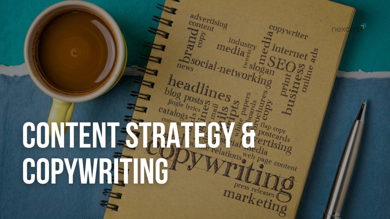
Blog Posts
Design That Sells: The Psychology Behind Colors, Fonts, and Layouts
Imagine walking into a shop with crooked signs, fluorescent glare, and cluttered aisles, you’d probably turn around and go somewhere that feels easier to trust. The same thing happens online in a flash: visitors form a judgement about your site in roughly 50 milliseconds, and that split-second feeling steers whether they stick around or bounce.
Design isn’t just decoration; it’s a sales tool. The right color choices set emotion and trust, the right typography communicates credibility before a single sentence is read, and the right layout gently guides users toward action. These visual cues, color psychology, typography for brands, visual hierarchy, and conversion-focused layout, are the unsung mechanics behind why some sites convert and others don’t.
Over the next few sections we’ll peel back the curtain on how colors, fonts, and layouts actually shape decisions (not just aesthetics), with real, practical tips you can use today. If you treat your website like a real storefront, designed to build trust and guide behavior, you’ll stop losing customers to bad design and start earning them instead.
The Power of Colors in Selling
Close your eyes for a moment and picture the brands you trust most. What color comes to mind first? For many, it’s blue is for Facebook, PayPal, USAA, because it whispers reliability. That’s not by accident. How we feel about color seeps into how we feel about a brand.
Color isn’t just decoration. It’s a nonverbal language that speaks to our emotions and subconscious faster than words ever can. Studies suggest that 62% to 90% of first impressions about a product or service are based on color alone.
When used purposefully, colors can:
- Build instant trust or authority
- Evoke specific emotional states
- Guide user attention to high-conversion elements
- Reinforce brand identity and recall
Below are a few color associations worth remembering (with some caveats, since culture and saturation matter too):
| Color | Common Emotional Associations | When to Use It |
|---|---|---|
| Blue | Trust, calm, professionalism | Finance, real estate, tech |
| Red | Urgency, excitement, passion | Sales, CTAs, limited-time offers |
| Green | Growth, wellness, balance | Startups, eco brands, health industries |
| Orange / Yellow | Friendly, energetic, optimistic | Creative brands, calls-to-action |
| Purple | Luxury, creativity, mystery | High-end, artistic, niche brands |
| Black / White / Neutrals | Sophistication, minimalism, clarity | High-end, clean brands, contrast purposes |
Take blue for instance, it’s almost a safe default for many websites because it’s broadly perceived as trustworthy and stable. Meanwhile, red elevates urgency: one popular experiment saw a red button outperform a green one in clicks, even though everything else was identical.
But don’t blindly slap on colors without context. Tone, shading, contrast, cultural meaning, and brand persona all shift how a color “feels.” For example, a neon green might come across as youthful and electric for a tech startup, but untrustworthy or cheap for a law firm.
What to do today:
- Start by defining brand emotions (e.g. trustworthy, energetic, calming).
- Pick a primary brand color that aligns with those emotions.
- Choose accent colors to draw attention to buttons, links, or key areas.
- Always test: run A/B color experiments to see real user behavior.
When you harness color well, your site becomes more than just pretty, it becomes persuasive. In the next section, we’ll look at how fonts layer on top of color to amplify that persuasion further.
Fonts That Speak Your Brand
If colors set the mood, fonts are the voice. When someone lands on your page, the typeface tells them one of three things in a flash: we’re professional, we’re playful, or we don’t care. That split-second impression shapes trust, readability, and ultimately whether someone keeps reading or bounces. Brand typography isn’t decorative, it’s communication.
Here’s the simple truth: pick fonts like you pick partners, intentionally and with personality. A few quick principles that make a big difference:
- Limit your toolkit => stick to one primary typeface for headings and one for body text (two is safer than three). This keeps your site coherent and professional.
- Choose for function first => readability matters more than “trendy.” Prioritize legibility (size, weight, line-height) before chasing a fancy display face. Small business pages, especially listings or service pages, should never make readers squint.
- Match personality to industry => Serif fonts often read as authoritative and established, while sans-serifs feel modern and approachable. For real estate, a clean sans for listings plus a tasteful serif for headings can communicate both modernity and trust.
Practical rules you can use today:
- Use no more than 2–3 fonts and rely on weights (light/regular/bold) to create hierarchy.
- Keep body size around 16px–18px on desktop and scale sensibly for mobile; increase font size in pricing or CTA areas to boost readability and conversions. Case studies show larger type can improve click-throughs.
- Pair a readable body face (think Inter, Open Sans, Roboto) with a distinct heading face (a refined serif or a bold geometric sans) to create contrast without chaos. There are curated pairings you can borrow from resources like FontPair and Typewolf.
Real-world example for real estate agents: use Open Sans for listings (clean, legible), Merriweather or a refined serif for neighborhood-guide headlines, and bump headline weights so important info (price, beds, CTA) stands out at a glance. That combination reads trustworthy and premium without feeling stiff.
Finally, test. Typography choices are cheap to A/B. Try a heavier headline weight, increase body size, or swap the CTA font and measure engagement. Font choices change perception and behavior, but real customers prove which combos actually sell.
Layouts That Guide Decisions
Think of your website like a well-run shop: the shelves, signs, and aisle flow decide whether a visitor wanders, wonders, or buys. A smart layout doesn’t shout; it gently leads the eye to what matters and removes the guesswork from choosing the next step. That’s the point of visual hierarchy, to show what’s important first, and what can wait.
People don’t read webpages like books. They scan, often in an F-pattern or Z-pattern, so place your core message and the primary CTA where eyes naturally land. For content-heavy pages, prioritize strong headings and left-aligned key facts; for landing pages, use a visual flow that moves from value → proof → action.
Two psychological rules to lean on: Hick’s Law (fewer choices = faster decisions) and Fitts’ Law (bigger, closer targets are easier to click). That means keep menus simple, reduce competing CTAs, and make your main button large and obvious. These small moves cut cognitive load and boost conversions.
Practical layout moves you can implement today:
- Put your value proposition + primary CTA above the fold so new visitors instantly see purpose and action. Test different hero layouts but don’t hide the point of contact.
- Use size, contrast, and whitespace to create hierarchy, bigger headings, higher-contrast CTAs, and breathing room around important elements.
- Guide with visual cues: arrows, images of people looking toward a form, or numbered steps that move users through AIDA
(Awareness → Interest → Desire → Action). - Reduce choice: lead with one obvious action, then offer secondary options less visually prominent.
Good layout design feels invisible when it works, users move naturally, feel confident, and the path to conversion is obvious. Treat every page like a mini-sales funnel and design the flow to answer the single question your visitor has: what should I do next?
Proven Layouts That Guide Visitor Decisions
A website isn’t just a collection of pages, it’s a digital storefront. The way your content is arranged can either make it easy for visitors to take action or confuse them and push them away. Let’s explore two layouts that are proven to guide users, build trust, and drive conversions.
Layout 1: Classic Hero + Three Content Blocks + CTA
This layout works perfectly for service pages or small business sites. It’s structured to lead visitors naturally from discovery to action:
- Hero Section
- Large headline with a value-driven statement.
- Concise subheadline explaining your offer.
- Primary CTA button (e.g., “Start a Project” or “Get a Free Quote”) placed above the fold.
- Optional visual showing your product or service in action.
- Content Block 1: Key Features / Services
- Display three columns or cards with an icon, headline, and short description.
- Focus on benefits, not just features, to make the value clear.
- Content Block 2: Social Proof / Testimonials
- Include client photos, names, and quotes.
- Builds trust and credibility with potential customers.
- Content Block 3: Additional Value / Case Study
- Highlight a recent project success, a key statistic, or a story.
- Keep it visual-heavy with minimal text for easy scanning.
- CTA / Footer
- Repeat the primary CTA for those who scroll down.
- Include secondary info like contact details, links, or trust badges.
Tip: Use white space generously, emphasize headings, and make buttons stand out to guide the eye naturally.
Layout 2: Z-Pattern Landing Page
Ideal for real estate or lead-generation pages, this layout leverages the Z-pattern scanning behavior, guiding visitors from the top-left to bottom-right:
- Hero Section
- Clear headline and subheadline introducing your service.
- Primary CTA button (e.g., “Book a Showing” or “Schedule a Consultation”) at the top-right.
- Hero image showcasing your property or business in action.
- Problem / Value Proposition Section
- Short paragraph addressing visitors’ pain points.
- Supporting image opposite the text for balance and flow.
- Property / Service Highlights
- Cards or horizontal sliders with listings or services.
- Include price, short description, and CTA on each card.
- Testimonials / Success Stories
- Horizontal or vertical display of client quotes and optional photos.
- Reinforces trust and credibility.
- Bottom CTA / Lead Form
- Large, contrasting form or scheduling widget.
- Add urgency or value (“Limited slots available”, “Get your free consultation today”).
Tip: Keep menus simple, limit distractions, and make your main CTA stand out. The Z-pattern naturally leads users to the next step, making conversion almost effortless.
These layouts are practical, proven, and adaptable. Implementing them on your website ensures visitors can find the right information quickly, feel confident in your brand, and are guided toward the actions that matter most for your business.
ALSO READ | Top Digital Marketing Strategies for Tampa Small Businesses in 2025
Conclusion: Design That Drives Action
In the world of digital marketing, design is more than aesthetics, it’s a strategic tool that influences behavior. By understanding the psychology behind colors, fonts, and layouts, you can create experiences that not only attract visitors but also convert them into loyal customers.
Remember, it’s not just about looking good; it’s about guiding your audience seamlessly through their journey. Whether you’re a small business owner, a startup, or a real estate agent, implementing these design principles can significantly impact your bottom line.
Ready to Transform Your Website?
If you’re looking to enhance your website’s design and boost conversions, NexCorp is here to help. We specialize in creating visually appealing and user-friendly websites tailored to your business needs.
👉 Contact us today to schedule a free consultation and start your journey toward a more effective online presence.
The Team, NexCorp
